Monday 11 December 2017

sparkly & peaceful


Andy Goldsworthy:  Snow Circles
Wishing everyone a sparkly and peaceful Christmas.


Andy Goldsworthy

Wednesday 6 December 2017

Turner Prize Winner 2017...

Lubaina Himid!

Many, many congratulations to Lubaina.  

As a student, Lubaina influenced how I saw my own work in a world seemingly dominated by men more interested in their own practises.  After one conversation with her, I remember struggling with a right handed video camera, the size of a ghetto blaster, to record lines of light shining into a large cardboard box, from inside the box!  An experience which went on to inform my final piece for the Fine Art degree. 

Lubaina also spotted that I think 3 dimensionally, something that changed how I saw my practise as an artist and later as a project manager.  To me that includes being able to keep an overview without loosing sight of the detail or conversely keeping an eye on the detail without loosing the overview.  This didn't change the way I worked but endorsed that my approach, although different was valid.

Later when Lubaina became Professor of Contemporary Art, I went along to the opening of her new gallery space underneath her offices in Preston.  The exhibition, called "Plan B" if I remember correctly, was a statistical representation of the new space and a record her life journey to that point.  I was astonished to see an Ordnance Survey map of Blackpool marked near where I lived as a child.  Apparently not only had Lubaina been a neighbour but, I found out as I explored the exhibition, we were born in the same year.

Very few students in my peer group had the opportunity to discuss progress with Lubaina, we were quite low down in the order of things but I will always be grateful for her honest feedback and her astute observations. 

I'm so proud Lubaina is this year's Turner Prize Winner - huge congratulations to her!

BBC news re Turner Prize 2017

Lubaina Himid website

Thursday 30 November 2017

negative space, brightness & snow

Working from a folded book made in Art Circle last year, we utilised the negative shape around it to draw it.  We then set our drawings in a landscape leaving parts of the paper white to depict brightness or snow.   
Mabel pushed the task further by creating a drawing that was made complete when placed next to a mirror.

Brilliant work everyone!

Mabel

Mabel (detail)

Angie

Mike

Christine
 
Dorothy

Monica

Thursday 23 November 2017

negative spaces & the Turner Prize

Rachel Whiteread was the first woman to win the Turner Prize back in 1993, nine years after it started.  Whiteread is known for making sculptures from negative spaces:  the space beneath chairs, the space inside baths & sinks, the space inside a Victorian House...  She makes tangible, absences and by doing so we're left with the impression of a ghost or trace of what wasn't there to start with.


"House" 1993 - 94 Grove Rd Bow London

"House" 1993 - 94 Grove Rd Bow London

Untitled (One-Hundred Spaces) 1995 resin, 100 units, dimensions variable

Monument, 2001
Resin and granite
354 5/16 x 200 13/16 x 94 1/2 inches (900 x 510 x 240 cm)

Installation at Trafalgar Square, London, United Kingdom

We looked at negative spaces and drew chairs using this approach.  Unfortunately, I didn't have my camera so empty spaces here, instead of images of our work!

This year's Turner Prize is announced on 5th December.  I'm rooting for Lubaina Himid not only the first person over 60 to be nominated but a Preston based artist too.

Lubaina Himid
Naming the Money 2004
Installation view of Navigation Charts, Spike Island, Bristol 2017
Courtesy of the artist, Hollybush Gardens, and National Museums, Liverpool
Photo: Stuart Whipps


Thursday 16 November 2017

something from the weekend...

I had the pleasure of drawing with friends & colleagues last Saturday, 11 November. 
Examples a couple of my pieces are below.  

These were made using water soluble, blue charcoal.  The first with white added & blended and the second (last image) using water & then working into it again using the colour.  I worked with an eraser too, on both, which allowed me to build up the layers.

Great fun - the day flew by.  Apologies to Curious Minds for the mess - I think we managed to clean it all - and many thanks to Bernie for organising the day.


colour: Mondrian & Rothko

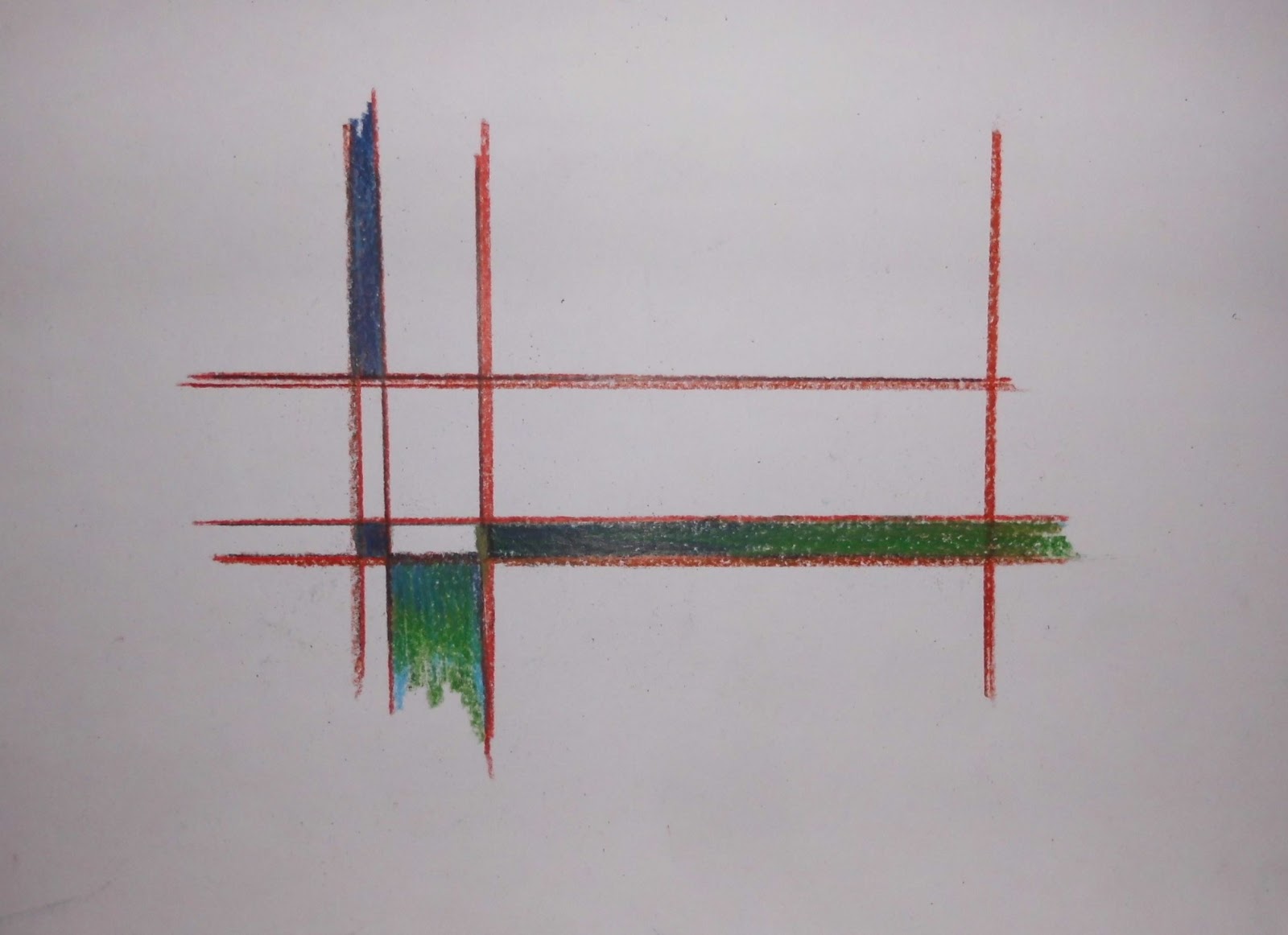
We looked at the work of Piet Mondrian & Mark Rothko; their interest in spirituality and their use of colour.  We reminded ourselves of the colour wheel and the solar spectrum then...

The Task
create a grid on A4 paper
fill selected squares / rectangles with mini colour fields
if necessary, re-draw the vertical & horizontal lines 

Well done everyone particularly Stuart who was outside his comfort zone & Monica who was this weeks star baker ⭐.
Next week, we'll tackle something more figurative.

Angie

Mabel

Monica 1

Monica 2 ⭐

Stuart (uncompleted)

Stuart (A4)

Thursday 9 November 2017

colour: sound and composition

Another extraordinary week!

We started by reminding ourselves of the colour wheel and different approaches to mixing colour using coloured pencils.  Then we looked at the solar spectrum and its relationship to music and sound.

Task
Using prepared A4 paper that had sheet music added
draw a musical instrument from the still life
add colour to depict the sound the instrument makes

Some finished pieces were then cropped using my magic corners.
The fab results follow...

Dorothy (cropped)

Dorothy

Mabel

Stuart

Stuart (detail)

Monica (detail)

Monica (detail)

Monica

Mike

Angie (detail)

Thursday 2 November 2017

colour: contrasts and containment

Still working with colour, we looked at using a printed image from a magazine and adding a contrasting border to contain it.  Our interest was primarily with colour although surface pattern and perspective slipped into the work made. 

As the drawings progressed, individuals styles started to emerge which always makes me happy.  

Well done everyone!  If I was going to have a star baker student this week, it would be Stuart who had begun to be more adventurous - brill.

Next week, we work on the paper we prepared this week.  I'll have spares too, if anyone would like to join us.  Space is limited so please email me.

demo page

Mabel

Mike

Monica

Stuart

Friday 13 October 2017

colour: wot - no red!


This week we continued experimenting with colour, this time working with watercolour paints.  By not using one primary colour, in this instance red, a more harmonious image can be produced.

Most of the group were newcomers to using this media which is notoriously difficult but you wouldn't guess that from the results.

Well done everyone!

[Thank you Angie for taking the photos. x]

Angie

demo page

Dorothy

Mike

Monica

Stuart
We have a break now to enable children staying at the St Ives Hotel to use where we meet.  

We're back on 2 November then each Thursday 11 - 12.30 until & including 7 December.

Friday 6 October 2017

colour: complimentary & mixing

Following on from last time, we had a look at complimentary colours:  the colours opposite each other on a colour wheel.  

When made by mixing the adjacent colours together, a more genuine and sympathetic complimentary colour emerges.  An orange, green or purple taken directly from the pallet is sometimes a brighter and often more distorted version of the true complimentary colour of the wheel.  [This has its own uses but not for us today.]
  
Complimentary colours can make effective shadows as demonstrated by the Impressionists and by mixing the complimentary colour, its effect can be more easily manipulated.  For example; a purple can be made more blue or more red by using the same two colours but in different quantities.

So - the task...
Working from the still-life, explore how complimentary colours work.

The outline of the drawings were made in pencil then artist quality colour pencils were used to bring out the colour.  

I've commented under some of the pieces which follow.
Notice individual styles are showing - which is very exciting for me!

 
demonstration pages
I think this is self explanatory.  Usual I would demonstrate as the session progresses which enables me to tailor my responses to individual needs but I knew drawing the colour wheels etc would take up too much time and decided to make use of getting up early to play.  


Stuart

Dorothy
 Dorothy began by putting red as a base for the green hat.  Unknowingly, Dorothy was using a technique many artist use to give their work vibrancy.  Excellent!
 
Judith

Monica

Mike
 The Womble's fur is definitely an example of less is more.  Brilliant!

Mabel

 This was an exceptional session - well done everyone!